
Colours are the first element that is communicated in an already noise-and-clutter-filled city where commercial buildings compete for everybody’s attention. It is colour that captures the eye first, even before discovering architectural details, materials, or even signage. A bright red storefront pulses with energy, a sophisticated black office tower speaks with quiet authority, and a warm beige residential complex reflects subtle charm. Starting from the loud declaration of retail behemoths to the subtle elegance of corporate head offices, colour is the strongest ambassador of brand identity in architecture.
Colour is more than just an aesthetic choice – it is a strategic tool. It triggers emotions, determines brand perception, and makes a commercial building iconic. Thoughtfully crafted architectural colour schemes communicate the values of the company so that its presence is not only observed but also experienced.
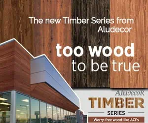
Aludecor believes facades and signage are branding powerhouses. The blog looks at the role of color in branding, principles for signage design, and the materials that are going to change the face of modern architecture and design.
The Psychology of Colour in Signage and Facade Design
The connection between colour and human psychology is profound, shaping our emotions, perceptions, and decision-making—whether in branding, architecture, or our interactions with our daily spaces. Research shows that people’s emotional responses vary by colour, making strategic colour selection a crucial factor in architectural color schemes. For architects and designers, choosing the right exterior building colours isn’t just about aesthetics; it’s about enhancing visual comfort and aligning with consumer behaviour to create impactful spaces.
Bold vs. Neutral: What Works Best?
The psychology behind colours in branding is not only to stand out but also to evoke brand identity through architecture. Different tones evoke different emotions:
- Bold Colours (Red, Orange, Green): Demand attention and create a dynamic presence.
- Neutral Tones (Grey, Beige, White): Evoke sophistication and timeless elegance.
- Dark Hues (Black, Deep Blue, Charcoal): Convey luxury and exclusivity.
Colour, when used effectively, makes a brand not only visible but also tangible, memorable, and recognizable.
Contrast and Legibility: The Role in Visibility and Impact
Visibility is everything in signage design principles. High-contrast colour combinations enhance legibility, wayfinding, and brand recall, ensuring effective signage and building façade aesthetics in different lighting conditions:
- Light text on dark backgrounds (or vice versa) improves readability from a distance.
- High-saturation colors are used for commercial spaces with heavy traffic-that is, red and yellow.
- Visibility is enhanced by metallic or reflective ACP panels in low light.
Contrast, colour psychology, and innovative material come together in a façade and sign to not just blend into the crowd but be above it all.
Read also: How Architects Use Natural and Artificial Lighting to Enhance the Visual Impact of Building Facades
Developing Brand Identity through Colour-Induced Facades
How Top Brands Use Iconic Colours for Signages for Instant Brand Recognition

Global and local brands understand that colour is an unmistakable branding tool that immediately evokes recognition and reinforces the brand identity subliminally. Whether it’s corporate headquarters or fast-food chains, colour works its magic instantaneously. Look at these examples in the industry:
- Fast food chains: Red and yellow stimulate the appetite and evoke a sense of urgency.
- Tech giants: Cool blues and silvers convey innovation and trust.
- Luxury brands: Deep blacks and golds exude exclusivity and prestige.
- Retail majors: Bright colours distinguish stores and draw attention.
Research in colour psychology shows that a consumer develops an impression about a brand in 90 seconds of the first encounter, and as much as 90% of that judgment is based on colour alone (Singh, 2006). This suggests that architectural colour schemes play a significant role in taking the visual identity of a brand beyond the logo and packaging into the built environment.
Corporate Branding Strategy with Architectural Colour Options

Effective brands have their exterior building colours match the broader marketing strategy. Such involves:
- Colour Consistency in Brands – Signage, internal décor, and façade have to be uniform.
- Environmental Context – Either the colour blends with the surroundings or contrasts it for better visibility.
- Legibility & Impact – The text must appear more readable and not obscure even from a distance.
- Material Innovation – Employing contemporary façade materials, which may lose their original colour vibrancy during weathering.
At Aludecor, we design innovative façade solutions that enable businesses to live their brand identity. Its signage design principles work on the basis that colour, material, and form come together to better both visual appeal and brand recall.
Read also: Future Trends and Innovations in Green Facades: A Path to Sustainable Urban Living
The Visual Impact of Colour in Urban and Commercial Signage

From the high-intensity billboards of Times Square to neon-drenched streets of Shibuya, the colour and light in urban landscapes create a fully immersive brand experience.
These districts prove how strategically chosen hues in signage and facades don’t just enhance visibility but define the identity of entire commercial zones.
Current architectural colour trends balance bold expression with contextual sensitivity. The challenge lies in designing building facade aesthetics that command attention while harmonizing with surroundings. Aludecor’s ACP panels offer:
- Vibrant, fade-resistant colors for long-term visual impact.
- Customizable finishes, from metallic sheens to rustic textures.
- Weather-resistant durability for lasting performance.
- Seamless integration with lighting and architectural elements.
- High-performance ACP panels feature heat-resistant coatings that help regulate building temperatures while ensuring long-term colour vibrancy.
By blending façade colour psychology with environmental analysis, a business can construct an aesthetically pleasing presence within the city streets that conveys meaning long before any one of the letters of text has been read.
Read also: How to Choose the Right Façade Material for Your Building
The Influence of Surrounding Architecture and Lighting on Signage Colour Selection

A sign or façade does not exist in isolation—it interacts dynamically with its environment. The urban landscape, natural and artificial lighting, and adjacent architecture all shape how colours are perceived and perform in real-world settings.
Key factors in choosing sign colours:
- Contrast with Environment – Choose colours that have good contrast with the background.
- Day vs. Night Visibility – Select high-contrast combinations and backlit elements to retain visibility 24/7.
- Reflections and Glare – Consider how sunlight, streetlights, and LED lighting will impact readability.
- Architectural Harmony – Choose colours that complement the building’s design without overpowering it.
Sustainability and Future Trends in Colour-Driven Signage
Sustainability is no longer an option in modern architecture; it is a must. Thoughtful color and material selection can minimize heat absorption, reduce energy consumption, and enhance environmental responsibility.
Aludecor’s eco-friendly ACP panels are the new benchmark for sustainable branding—designed for durability, environmental responsibility, and long-term impact. Our eco-friendly ACP panels:
- Are 100% recyclable, reducing environmental waste.
- Have lead-free coatings, ensuring cleaner air quality.
- Use energy-efficient manufacturing with reduced emissions.
- Provide long-lasting durability, minimizing replacements and waste.
Future-Proof Façade Design: Adaptive Colours and Energy-Saving Innovations
The future of signage is adaptive colours and smart materials. Photovoltaic coatings, dynamic shading solutions, and self-cleaning facades are changing the face of sustainability in branding. At Aludecor, we are at the forefront of this change, bringing future-ready materials that merge aesthetics, functionality, and environmental responsibility.
Conclusion
Colour is a potent branding medium that molds perception, engagement, and recognition. It ranges from vivid commercial facades to signages and sustainable innovations, always dictating how a brand communicates with the target audience.
At Aludecor, we are reshaping architectural branding by bringing avant-garde façade solutions. Our ACP panels, UV-resistant coatings, and sustainable materials enable brands to create stunning, long-lasting impressions.
- Key Takeaways for Architects, Designers, and Businesses:
- Colour helps enhance consumer perception and brand recall.
- Material innovation ensures durability and long-term vibrancy.
- Sustainable and energy efficient choices future-proof façade design.
- Digital and interactive signage is defining the next wave of branding
As businesses and architects push creative boundaries, façade branding is no longer just about visibility, it’s about making a lasting statement.